Product Configurator Examples: 19 Real Brands and What Makes Each One Work
Product Configurator Examples: 19 Real Brands and What Makes Each One Work
Retail Furniture & Visual Commerce
13 min read
Technical writer
John Fresco
Updated:
03 Oct 2026
Posted:
03 Oct 2026
The best product configurator examples share one trait: the customer stops browsing and starts building. Nike lets you pick the colorway of a sneaker, BMW lets you inspect the car you just configured, and a shed builder lets you specify exactly the building you need. This guide walks through 19 real examples, grouped by how each configurator actually works rather than by industry, and explains what each one gets right so you can borrow the idea instead of just admiring a screenshot.
Some of these are household names. Others are projects our team at Vivid 3D has worked on, which means we can tell you what sits behind the interface, not only what it looks like from the outside.
What Counts as a Product Configurator (and What Doesn't)
A product configurator is a tool that lets a buyer assemble a product from a defined set of options and see the result before ordering. Color swatches on a product page don't qualify. A configurator needs choices that interact: pick this fabric and the leg finishes change, pick this engine and the wheel options narrow, pick this width and the door count updates.
Two neighbors get confused with it. A product visualizer shows one fixed item from every angle, with no options to change. A virtual try-on, like a makeup or glasses app, places a product on you but rarely builds a new variant. Both are useful, but neither is what this article is about. If you want the mechanics of building one, our guide to how to build a 3D product configurator covers the stack.
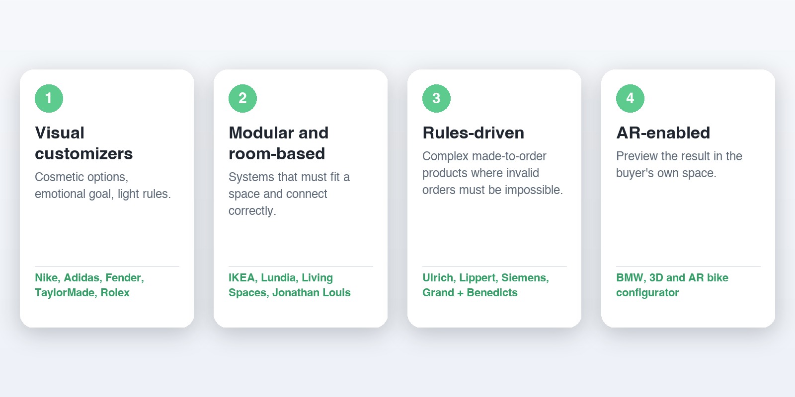
The examples below fall into four patterns. Spotting your pattern first saves a lot of wandering.
This is the pattern most people picture first. The product is fairly simple, the option set is mostly cosmetic, and the goal is emotional: make the buyer feel ownership before checkout. Rules exist, but they are light.
Nike By You and Adidas Team Uniforms
Nike By You lets shoppers choose colors and materials for a sneaker and add personalized text, then rotate the result. The work is in the restraint. Only the parts of the shoe that read well at a glance are customizable, so almost every combination looks intentional. Adidas takes the same logic into team sportswear, where a club or school can adjust colors, patterns and initials on a uniform and see the whole kit before ordering a batch.
The lesson: limit the options to the ones a buyer can judge by eye. Offering fifty swatches on a surface nobody notices makes the configurator slower and the product worse.
Fender Mod Shop and TaylorMade
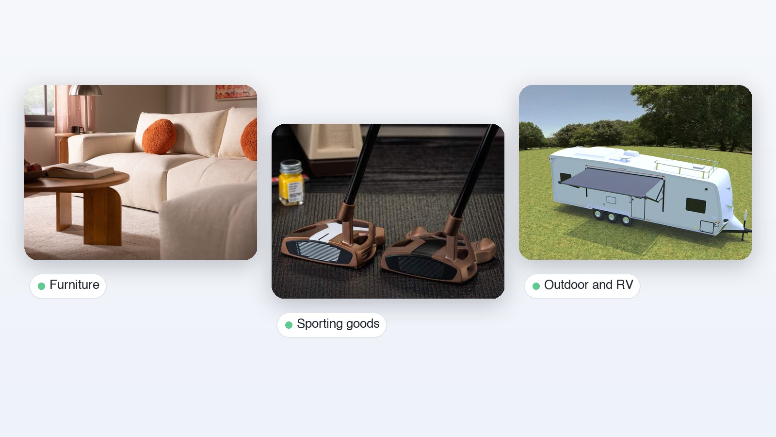
Fender's guitar customizer lets players swap components and finishes, and the instrument updates as they go. Guitars suit configurators because buyers already think in parts: body, neck, pickguard, hardware. TaylorMade's personalization experience for drivers, irons and wedges follows the same instinct. It is also one of ours: our team handled the 3D modeling and full configurator setup for a 3D web experience, and the program grew to more than ten separate 3D configurators across the product line.
That count is the real takeaway. A golf brand has many club types, and each one needs its own model, option rules and materials. Teams that plan for one configurator and end up with ten learn quickly that the asset pipeline matters more than the interface.
Rolex
Rolex shows the opposite instinct from Nike. Buyers choose a model, case material, dial color, bracelet and bezel, and the set of options stays deliberately tight. Fewer options, higher fidelity, slower pace. If your product sells on prestige, this is the pattern to study: the configurator is a showroom, not a toy.
Modular and Room-Based Configurators
Here the customer isn't customizing one object. They're assembling a system that has to fit a space, which changes the problem. Dimensions matter, sections have to connect correctly, and the product often has hundreds of valid layouts.
IKEA and Lundia
IKEA's visual tools let shoppers design sofas, kitchen cabinets and wardrobes by choosing configurations, colors and materials, and see how the pieces combine. Lundia, a Nordic shelving maker, applies the idea to modular storage where the buyer builds a unit section by section. In both cases the configurator hides the engineering. The shopper sees a bookcase, while the system quietly enforces which sections can connect to which.
Living Spaces and Jonathan Louis
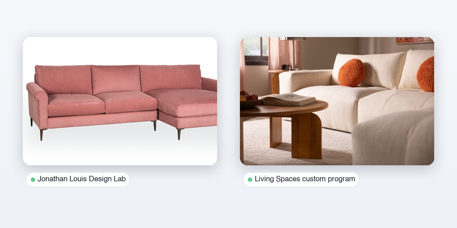
Furniture is the category where we have the deepest history, so these two are worth a closer look. Living Spaces runs a custom program built on thousands of 3D models and configurators, covering sectionals with fabric choices. For both Living Spaces and Jonathan Louis, our platform handled the 3D content pipeline and digital asset management behind the scenes, while the shopper-facing experience ran as a WebGL configurator.
The Jonathan Louis Design Lab is a good public example to click through. It works from more than 100 3D models and over 750 3D materials, and it connects to Salesforce Commerce Cloud so a configured piece flows into the normal order process. The number worth noticing is 750. Materials are what make furniture configurators expensive to maintain, because every fabric has to look right on every model. A managed asset library is what keeps that from turning into chaos. Our overview of 3D furniture configurators goes deeper on that side of the work.
Rules-Driven Configurators for Made-to-Order Products
This is the least glamorous pattern and often the most valuable. The product is complex, the buyer may be a business, and a wrong combination costs real money at the factory. The configurator's main job is to make invalid orders impossible.
Ulrich Lifestyle and Lippert
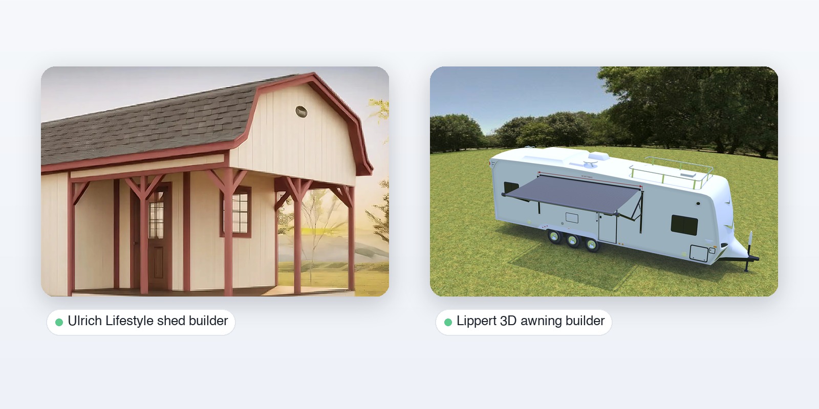
Ulrich Lifestyle sells individual sheds, and each one used to start with a brief and many hours of phone calls and email. A 3D shed builder replaced that exchange: the customer sets precise parameters and sees the shed, and the order arrives already specified. The configurator offers more than twelve highly configurable shed models. The gain is mostly invisible, because the saving is the conversation that no longer happens.
Lippert's 3D awning builder for Furrion awnings handles a different version of the same problem. Buyers choose size, fabric, frame color and lighting, and the tool produces a specific awning for an RV. The option list is short, but the dimensions have to be right, which is why a WebGL view beats a static picture here.
Siemens and Industrial Equipment
Siemens offers configurators that let engineers assemble industrial equipment down to individual components such as motors and converters. These tools look nothing like Nike's, and they shouldn't. They favor compatibility checks and structured part lists over visual drama. Industrial buyers want a correct bill of materials first and a nice render second, and the best of these tools respect that order.
Grand + Benedicts
Grand + Benedicts sells retail fixtures such as gondola shelving, a product where a mismatched component means an install-day surprise. Their configurator exists to cut ordering errors in a B2B sales process, not to delight a consumer. If your buyers are procurement teams, a boring configurator that prevents mistakes will outperform a beautiful one that allows them.
Vehicle Configurators: BMW, Tesla and What Premium Looks Like
Cars are the category everyone benchmarks against, and for good reason. A vehicle has an enormous option space, strong rules (this trim excludes that wheel), and a buyer who has already decided to spend serious money. BMW's configurator lets buyers change colors, trims and interior options in real time and view the result, and it adds augmented reality for viewing the car in the buyer's own space. Tesla's takes a much more linear route, stepping the buyer through a short sequence of decisions toward an order.
The two show a real design choice. BMW is exploratory and immersive, while Tesla is guided and fast. Neither is better in general. The right one depends on whether your buyer enjoys deliberating or wants to finish.
AR-Enabled Examples
Augmented reality takes a configurator out of the screen and into the room. The best implementations don't treat AR as a gimmick, they use it for the one question a screen can't answer: will this fit and look right where I live?
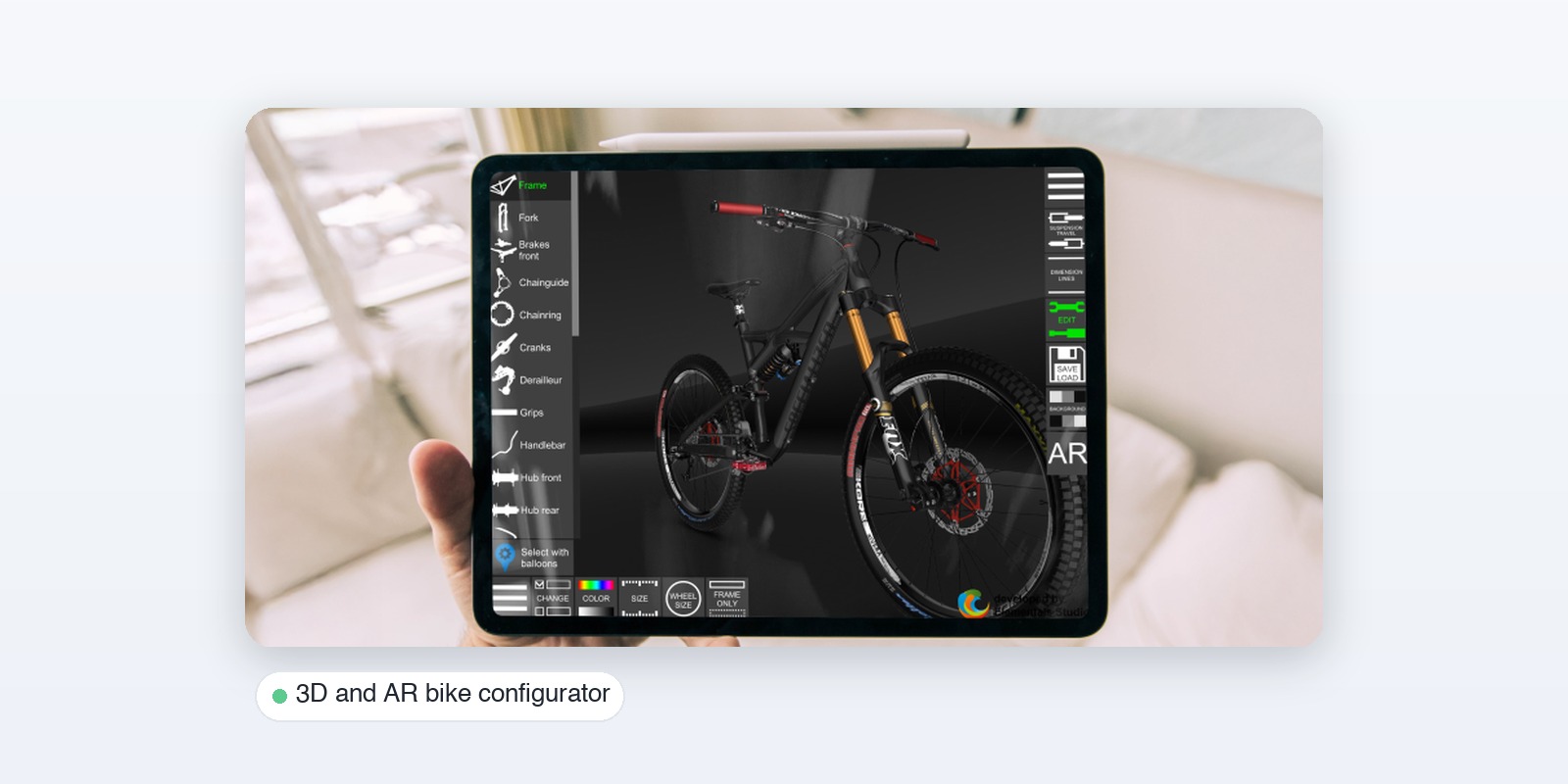
BMW's AR view answers it for cars. A different, and more surprising, example comes from the bike world. One 3D bike configurator our team worked with lets riders configure a bike in 3D and AR, set part sizes, choose colors and even check how the bike behaves physically. It has been downloaded more than five million times and holds a 4.3 rating on Google Play, and it was one of the first non-game projects featured in the Unity showcase gallery. The lesson is that a configurator can be a product in its own right, not just a feature attached to a product page.
Smaller Brands Prove Configurators Aren't Only for Giants
Every list of product configurator examples leans on Nike, BMW and IKEA, which can leave the impression that you need an enterprise budget and a product everyone knows. Three projects from our own portfolio say otherwise.
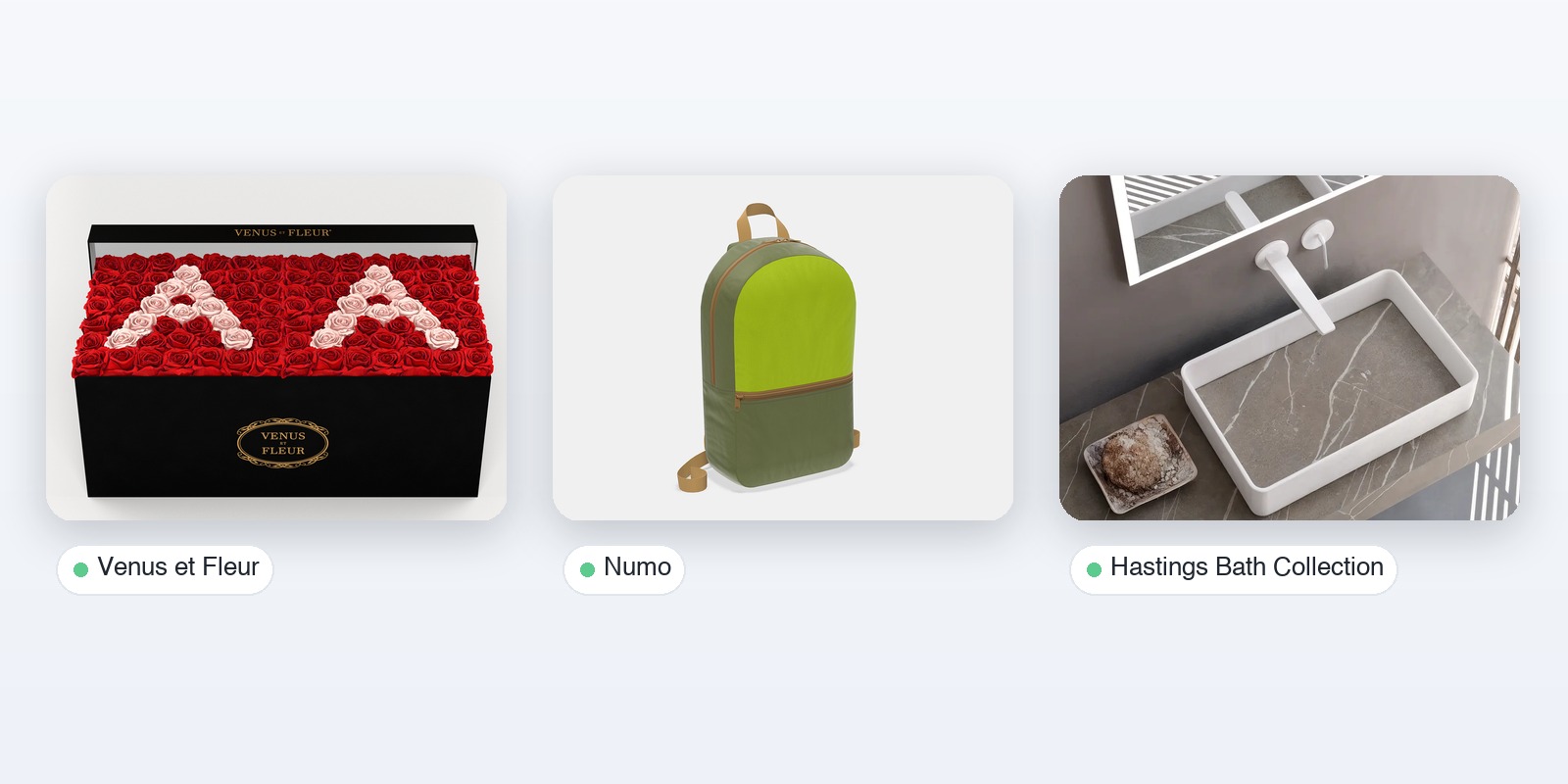
Venus et Fleur sells custom flower arrangements, a product that is hard to photograph in every variation. Their configurator is a V-Ray experience, and the whole product catalogue was digitized through renders, so a shopper can see the arrangement they are building instead of imagining it from a generic photo. Numo takes a different route. It runs a library of configurators for promotional products, more than 150 in 2D and more than 20 in 3D, where buyers choose a product type, color, logo placement and packaging. The mix is deliberate: flat products get a flat configurator, and only the items that need rotation get 3D. Hastings Bath Collection uses real-time rendering so a customer can see a bathroom vanity setup in high quality, backed by the same kind of managed 3D content pipeline, with more than 100 models and over 750 materials behind it.
None of these brands has a global marketing machine. What they share is a clear product, a defined option set and a content library that someone owns.
Mistakes the Best Examples Avoid
Looking at what these configurators leave out is as useful as looking at what they include.
The first mistake is option overload. The Nike and Rolex approach, a deliberately short list of choices, works partly because every extra option adds a decision, and every decision is a place to quit. The second is treating the interface as the project. In the furniture and bath work above, the hardest part was never the buttons. It was getting hundreds of models and materials to look consistent and stay current as collections changed.
Third, the weaker configurators ignore the order that comes afterward. Ulrich's shed builder works because a configured shed becomes a specified order. Jonathan Louis works because the piece flows into an existing commerce platform. A beautiful configurator that ends in a screenshot and a "contact us" form leaves the best part of the value on the table. Fourth, heavy 3D scenes can punish buyers on phones. That is why the mix in Numo's library, flat where flat will do, is a sensible default rather than a compromise.
How to Evaluate Any Configurator in Five Minutes
You can open any of the configurators above and judge it yourself. Skip the marketing page and run a few quick tests.
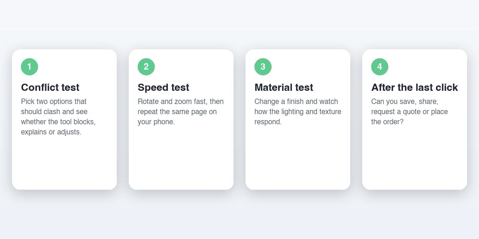
Start by choosing two options that ought to conflict, a wide frame with a narrow door, for example, and see what the tool does. A good configurator blocks the choice, explains why, or quietly adjusts the second option. A weak one lets you build something nobody could manufacture. Next, rotate and zoom as fast as you can. Lag and blurry textures on a fast connection will be worse on a phone, so open the same page on your phone and repeat the test. Then change a material and watch how the lighting responds. If a fabric looks flat or plasticky, the underlying assets weren't prepared with care, no matter how polished the interface is.
Finally, look for what happens after the last click. Can you save the design, share a link, send it to a salesperson or place an order? The configurators with the highest business value, such as the shed and awning builders, end with a usable specification. The ones that end with a pretty picture and nothing else are demos.
What to Borrow From These Product Configurator Examples
After walking through all 19, a handful of ideas keep repeating. These are the ones worth stealing.
How to Pick the Right Configurator Type for Your Product
Start from the product, not the technology. A simple product with cosmetic options belongs in the visual customizer pattern. A product that has to fit a space belongs in the modular pattern. A product with real manufacturing constraints needs a rules-driven build, and anything sold through dealers or sales reps probably needs both a configurator and a quote workflow behind it.
One more filter helps: how many products you need to cover. A single hero product can justify a hand-built experience. A catalog of hundreds cannot, which is why projects like Living Spaces rely on a managed library of models and materials that feeds many configurators from one place, rather than one build per product.
If you're still deciding between tools and platforms, our comparison of the 10 best product configurators lines up the vendors side by side, and it pairs well with this article: that one helps you pick a provider, this one helps you pick a pattern.
How Vivid 3D Approaches Product Configurators
Most of the pain in a configurator project isn't the interface. It's the 3D content behind it: models that don't match the spec sheet, materials that look different in every tool, and assets that get rebuilt for each new channel. Vivid 3D focuses on that layer. We manage the 3D asset library and content pipeline, so the same source model can feed a configurator, product renders and AR, and we have shipped this for furniture, sporting goods, outdoor structures and bath collections. You can see more of the work on our case studies page.
If you're collecting product configurator examples to decide what to build, the pattern you choose matters more than the brand you copy.
Frequently Asked Questions
What are the main types of product configurators?
Most fall into four groups: visual customizers for mostly cosmetic options, modular and room-based tools for systems that must fit a space, rules-driven configurators for complex made-to-order products, and AR-enabled tools that preview the result in the buyer's environment. Many real projects blend two of these.
Do I need 3D, or is a 2D configurator enough?
Two-dimensional configurators work well when the product is flat, simple or sold mainly on color, since swapping prerendered images is fast to build and light to load. Choose 3D when buyers need to rotate the product, check how parts fit together, or judge materials from several angles, as with furniture, vehicles and equipment.
Which industries get the most value from configurators?
Furniture, vehicles, footwear and sporting goods are the best known, and each has strong examples above. Made-to-order manufacturing benefits just as much, often more, because a configurator removes ordering errors and long specification conversations.
How long does it take to launch a product configurator?
It depends mostly on the state of your 3D assets. A team with clean, spec-accurate models and organized materials can move much faster than one starting from raw CAD files, and a first configurator is usually followed by more. Plan the asset pipeline before the interface.
What is the difference between a product configurator and a CPQ?
A product configurator handles what the product can be, while CPQ (configure, price, quote) adds the commercial layer for sales teams. Many B2B products need both. We compare the two in sales configurator vs product configurator.